
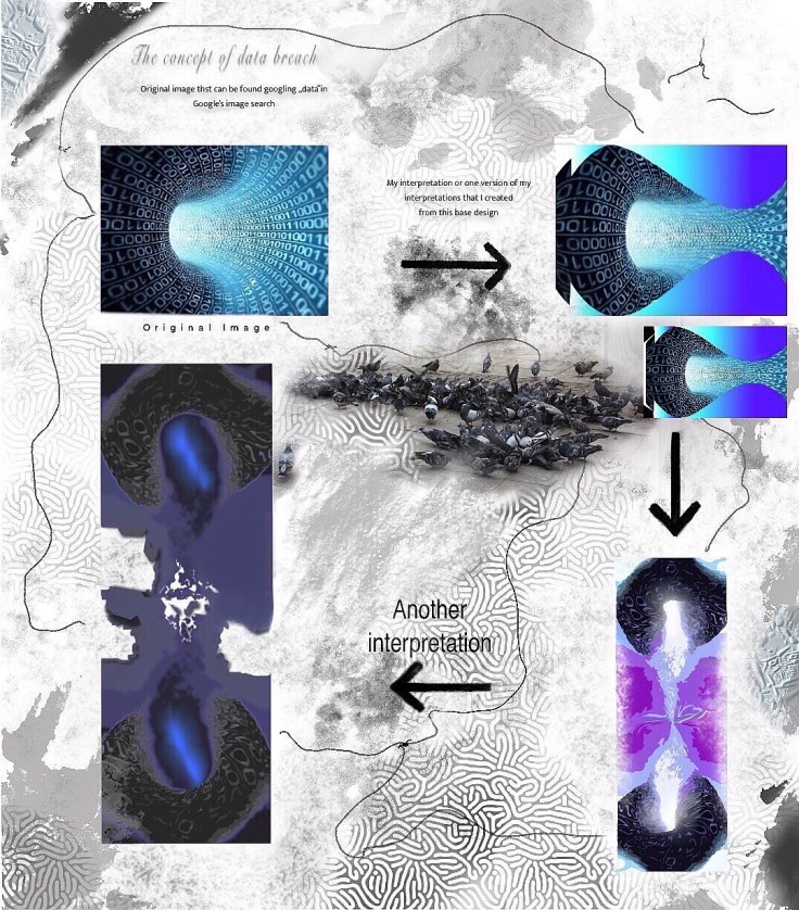
Before you check out the infographic sampled and versions below, check out also this diagram of sorts I did that could work as a template for other text or images where the data breach visuals are located:
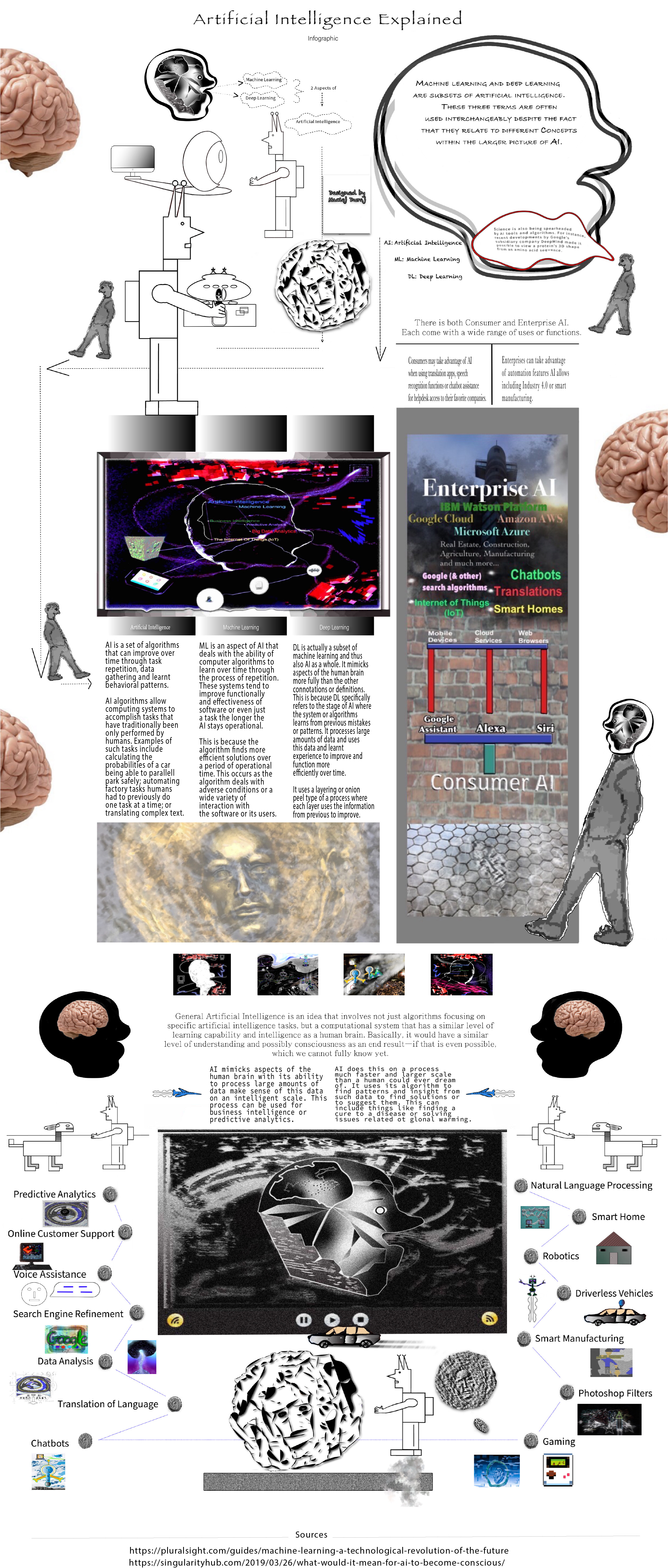
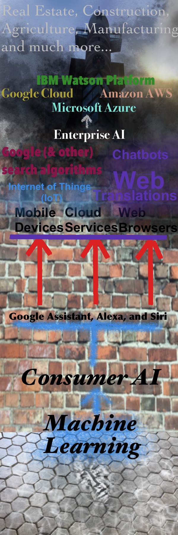
Here are the updated versions of the full infographic:
Here is the embedded jpeg file (may need to zoom in if viewing on browser or download):
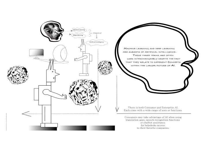
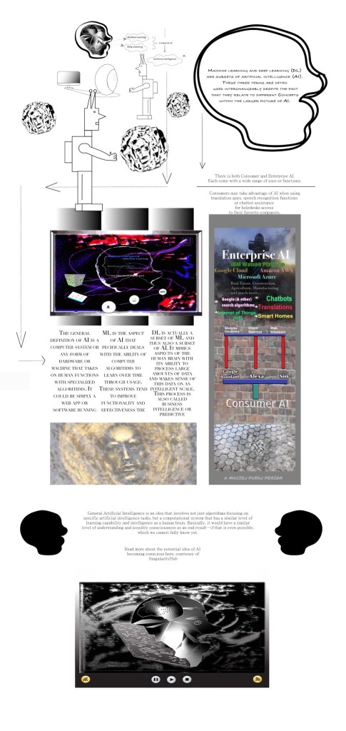
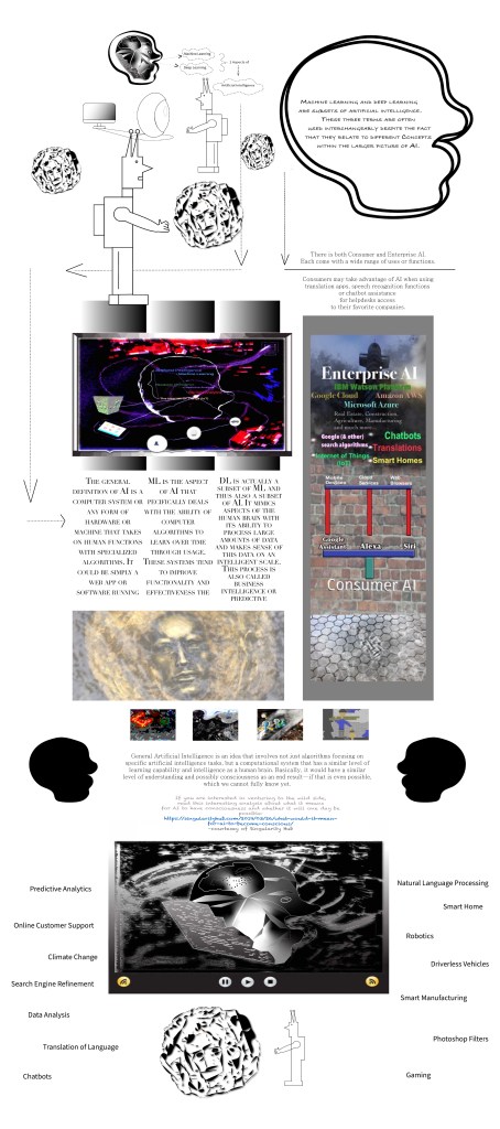
Some of the previous versions:
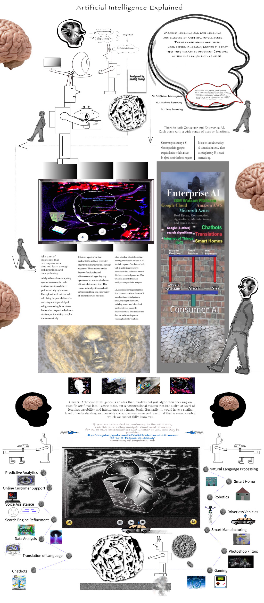

Anyone who is into infographics or visual depictions of data and information, should check out what I created out of basically all of my own assets. I started trying to think of a background layer that is unique in nature and will provide interesting infographic canvas. I also realized an infographic should be in the dimensions of 600×1800 although it doesn’t always have to be.
So what I did was first create this background layer in these dimensions out of a mixture of my own photography I took on an iPad, graphic design I created from scratch, filters to existing assets I had, and general playfulness.
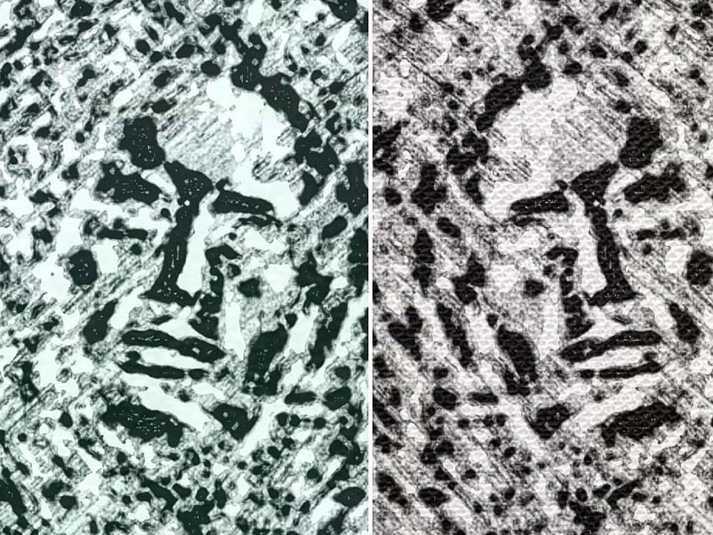
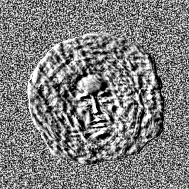
The first images are filtered and changed (by me) images of a face through visual design that I originally photographed of a statue of sorts here in Warsaw. It is a face that was siting in water, which I photographed. Below is my assets I used in terms of photographs I personally took and my own designs into the short infographic I created:


Next I decided to use a brick wall and a tower from photographs I also took. The brick wall is an a very important brick and landmark in Warsaw and offers a great background texture to be used for the info text or data of the infographic, or that was my initial intention until I realized how dark and vivid it is.


Then I decided to add a bunch of filters, paint brush strokes and eraser action to top it off. And I ended up with this concept of machine learning. Thus here is the bery basic and simple infographic. I will continue to create infographics and make more elaborate ones in the future — possibly in different dimensions or offering more of my assets or new graphic design designed from scratch.
I actually just started experimenting with different image assets I had and tried to turn something i to this format in terms of pixel dimensions and it was not thoughht out or planned. I only decided to turn it into an AI infographic after I realized the face at the bottom could be used for such a metaphor or signify AI used for different aspects — from enterprise to consumer machine learning and from manufacturing to IoT devices.
Here are the different phases of the graphic and how it evolved from concepts over time:

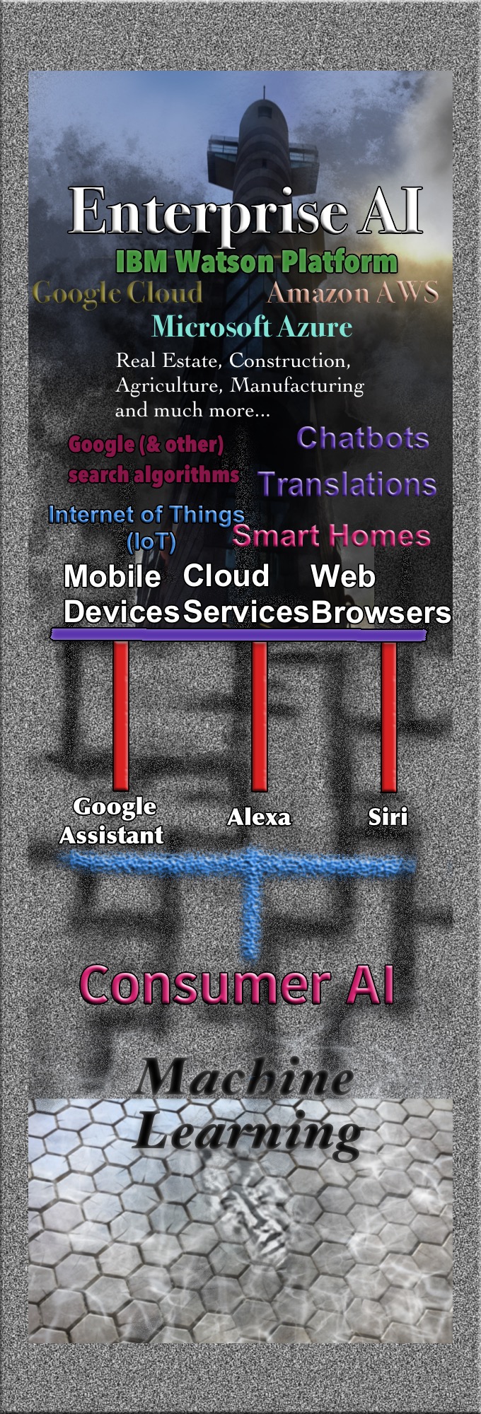
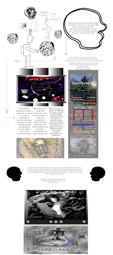
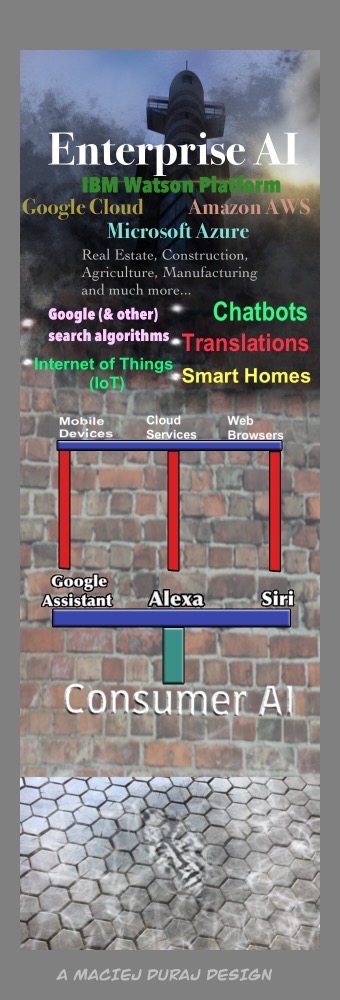
And below is the final version I have thus far:

As some of you may also recall, I briefly touched upon the history of infographics or one of the founders of the modern concept of an infographic, Fritz Kahl, in my recent interview with a representative of the mobile game studio Arte, a studio publishing the upcoming Homo Machina game.
Infographics are a huge fad right now and an impressive revenue steam for anyone who can create them from scratch and can do both the visuals and find the right data for them — or either or. This is because many start ups and companies are leveraging them across websites and social media to showcase their brands and products — as well as differentiate what they offer from competition. I hope to work more on such creative works and be commissioned if anyone is interested on further ideas.
I previously was commissioned finding the data and research for an infographic by an infographic company called Visual.ly. I would not mind working further with this company on either that aspect of infographic design and creation or any other of the infographic process. It is a bit difficult however when they do not reply to your e-mails and the previous person you worked under has moved on.
Despite this, it was a good experience and the full infographic is available on my portfolio or can be accessed here (yes it is much more elaborate, but also done with multiple people over a much longer time span). I may try to create something this elaborate as I continue to improve using Illustrator and the pen tool, but need a good topic with some quotes or stats to back the infographic up like the one below I contributed to:

My infographic From above is a lot simpler with less visual highlights, but I think it gets the job done doing a quick comparison between consumer and corporate or enterprise AI concepts. I would put it in a category more similar to this infographic I found randomly on the Web:


Leave a comment